Client | Long Beach Community Compost
Role | Creative Direction and Brand Design
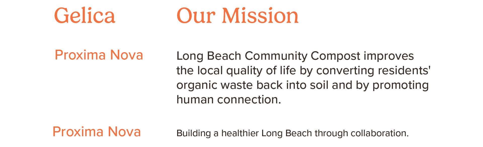
Long Beach Community Compost improves the local quality of life by converting residents' organic waste back into soil and by promoting human connection.
- Creative Direction
- Logo Identity
- Type, Color, and Visual Language System
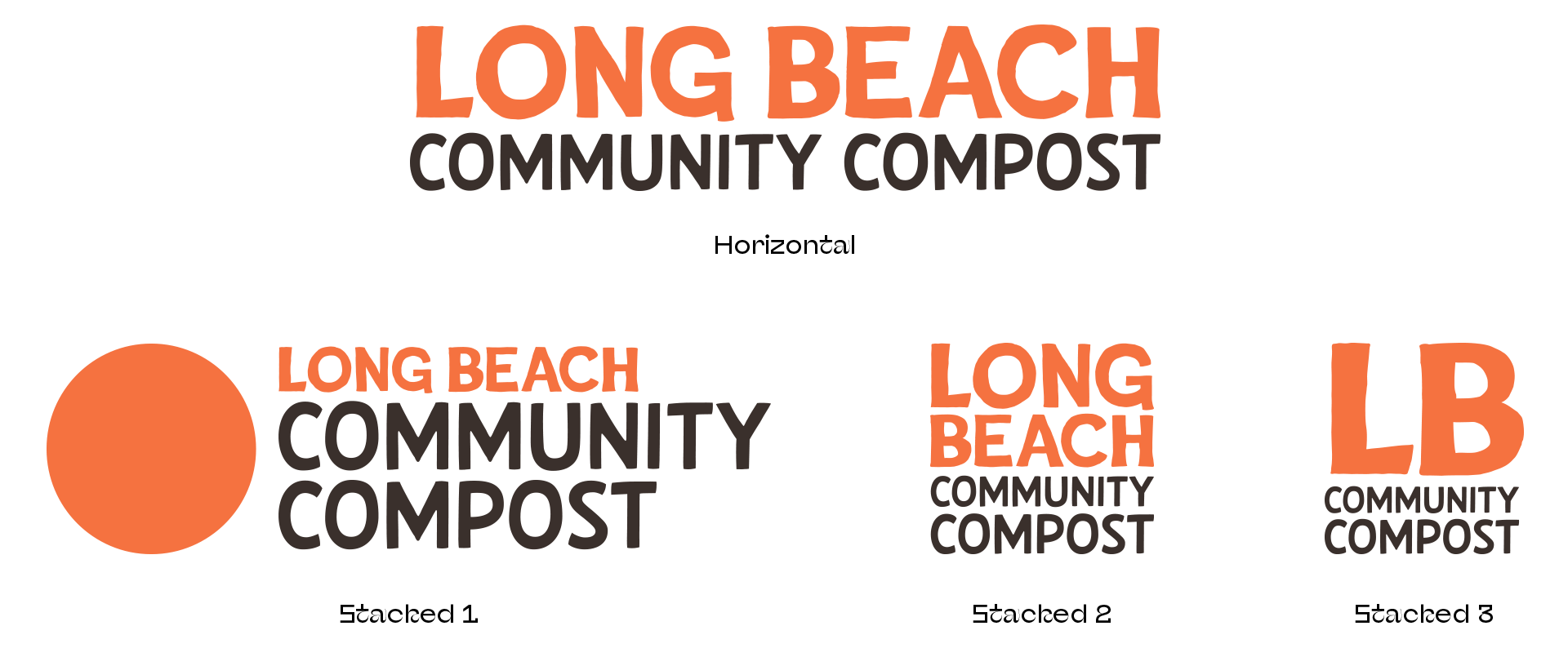
Logo Identity
Develop a distinctive visual identity and logo that reflects Long Beach Community Compost's commitment to sustainability, environmental stewardship, community engagement, and local impact. The new identity should increase recognition, strengthen credibility, and provide a consistent visual foundation across print, digital, educational, and community outreach materials.
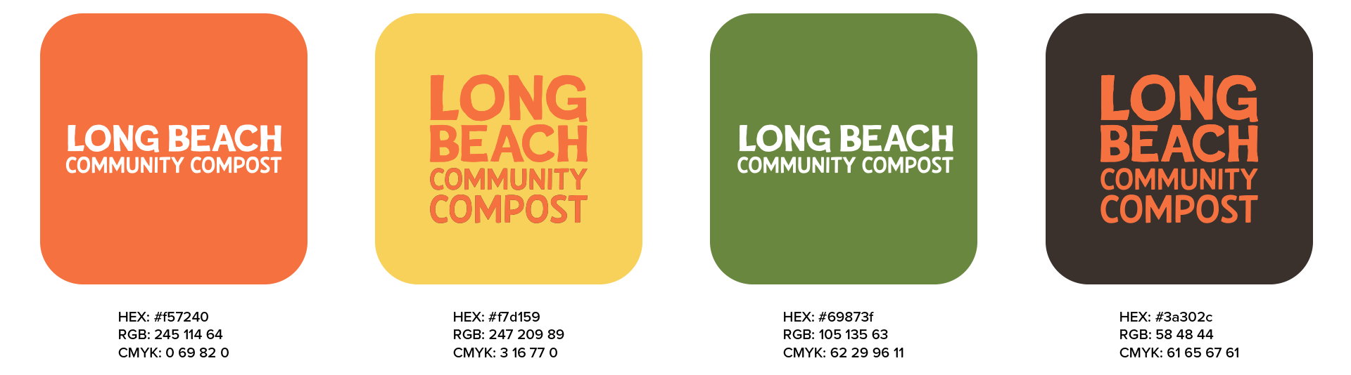
Brand Color Palette
The color palette was developed to reinforce Long Beach Community Compost's mission of sustainability, growth, and community connection. Inspired by natural composting processes and the local Southern California landscape, the palette combines earthy greens, rich soil tones, and warm organic accents. These colors communicate environmental responsibility, regeneration, and accessibility while creating a cohesive and recognizable visual identity.
Typography
Two fonts define the visual identity of Long Beach Community Compost:
1. Gelica, a friendly and approachable personality.
1. Gelica, a friendly and approachable personality.
2. Proxima Nova, a function font, great for UI and legible content blocks.